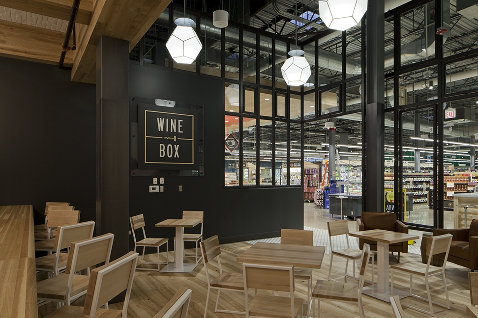
There are three things that are involved in the language of design; nature, memory, and history. A lot of significant parts of the design are linked to tradition and culture.
We subconsciously use reference points when it comes to design, which we’ve been exposed to through endless images, motifs and forms.
We all have the potential to speak this language fluently, however, just like language based on words, some that speak the visual language are more poetic and persuasive than others.
Just as we have all experienced beauty and inspiration, we have all seen buildings or spaces where the beauty has been defaced by bad alterations or careless maintenance.
We have all been in spaces where we just couldn’t wait to leave. The colours, lighting, imagery, sounds and smells are uncomforting and jarring.
There are some uses for the language of design that are very subtle and subliminal.
Fast food restaurants are well known for finding ways to simultaneously motivate you to want to buy their food, but also move you through the system and out the door quickly. They use large close-up pictures of food to encourage you to make your purchase. When you find your way to a table it’s always small and fixed at a certain distance from the chair. It’s just comfortable enough for sitting to eat your burger and have your drink, but not so comfortable that you’ll want to hang out all day long. That is all part of the language. It says, “Eat something fast, and have a great 15 minutes – see you next time.”
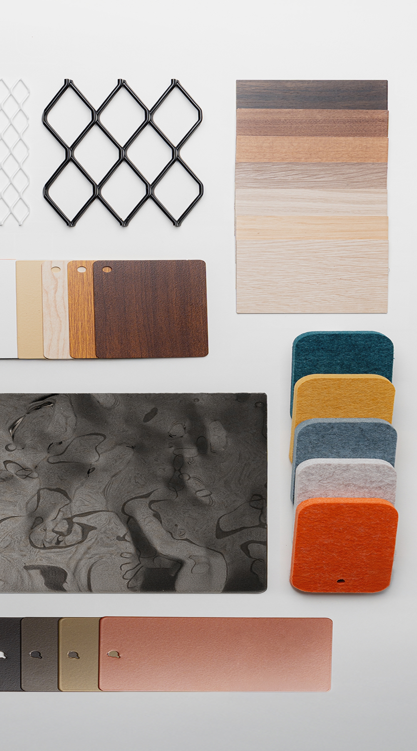
Places like this use mostly red and yellow. These are the two brightest colours in the colour wheel and speak of having the basic needs of hunger and stimulation met. Colour is a major way of suggesting sensory response when speaking the visual language.
Not all images are guaranteed to generate an identical response in every viewer. It’s when a combination of images and design choices add up consistently that the message can be felt clearly in any environment.
Source: Interior Design Institute
